Words by Brian Kayser — Book Jacket Design, Illustration

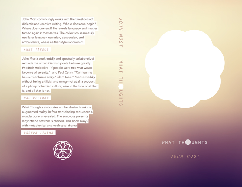
I’ve been working on these Words books [+] for awhile now. Each one is a collection of interviews with legendary artists. It started as one book but now it’s being compiled into volumes.

I spent many years discovering new music by actually digging through records, tapes and cds in stores, attics, basements and yardsales. I read my favorite artists’ point of view in print before twitter decimated a pretty robust culture of magazines. So this is a pretty special bit of work. Journalism in print! It’s high art, man.

This collaboration with Brian Kayser has segued into other book jacket design and illustration projects that I’m excited about. I’m working on a couple of children’s book ideas and currently designing a jacket for another different collection of interviews from an independent hiphop label out of London. I won’t say to much about those things yet but once they get printed, I’ll be posting details of them here.

Get a better look at the covers in my design portfolio [+] or on my instagram feed [+].

Listen Silent

Stillness will lead you to a new awareness. Though it never really happens. Even the roots of a tree are on the move, finding water and soil while being still. Sitting motionless is a nice aspiration, but don’t forget to breathe. Breathe totally but listen closely and invite silence to access stillness. Stillness exists only behind the things. It’s the space that is not subject to motion.

Listen Stillness is Silent [+]

Washington Football

It’s really unfortunate that the Redskins’ name is such a relic. One of the oldest teams in the league and one of the strongest traditions.

Art Monk is still a hero of mine. Coach Gibbs too.

The name is the only thing that connects this organization to the team I grew to love as a kid.

This team has a different owner, a different venue, a different coach x 10. The only loyalty equity that remains is this backwards, unfortunate, relic of a name.

I understand that some people don’t mind the name. I also understand that how a person commands language often reflects their level of education first, and their interpersonal awareness, a close second. The word choice of this team name is backed up by an ugly cultural history and complex heritage.

It always seemed odd but it’s only recently become a discussion.

As I pondered how the team may maintain a visual identity while preserving decency on a human level, I considered Redhawks and other variations that could keep the R, the color scheme and the feather. But those marks will always say “Redskins” whether that’s what it says or not.

I began playing with the logotype and rearranging the letters to see what may be there. “Ridneks” is a total winner. Change the name, keep the logotype. This communicates the unrelenting commitment that Dan Snyder has to “honoring” a continent of diverse peoples with one overarching approximated slur.

Here’s an alternate logotype rehash that would probably sell tshirts like hotcakes at a flag rally.

skins-skinerd